
Revamping a Icon: The 2008 Pepsi Rebranding Controversy
Changing the image of a legendary brand is a meticulous and risky process. It involves the potential rejection of the public, who are accustomed to logos, typefaces, and styles with which they have formed particular attachments. This is why the rebranding of Pepsi in 2008, which was both radical and unexpected, attracted considerable controversy. The most notable aspect of this controversy stemmed from a 28-page document that detailed the reasons behind the change.
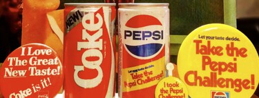
The Logo of the Past
Pepsi’s logo is distinctive and has undergone numerous transformations throughout its history. Initially branded as Brad’s Drink between 1893 and 1898, the name evolved, and so did the logo. Before 1962, the original Pepsi-Cola logo experienced seven versions, all of which displayed a calligraphic style with a vintage flair. The patriotic colors of red, white, and blue made their debut in 1951, coinciding with post-World War II sentiments. From the ’60s onwards, the logo experienced modernization, evolving into what we now recognize as the Pepsi brand, with significant relief details introduced to further enhance its aesthetic appeal.
The Logo of the Future
By 2008, Pepsi was at the zenith of its popularity, featuring star-studded advertisements with celebrities like Britney Spears, Pink, and Beyoncé, all contributing to a captivating youthful aesthetic. However, the rebranding effort sparked heated debate due to the radical changes in the design of the iconic circle featuring the red, white, and blue stripes. The new logo diverged dramatically from previous iterations, departing from the classic parallel lines that were reminiscent of a waving American flag. This controversial redesign was no small feat, costing the company a remarkable million dollars, which went directly into the pockets of the Arnell Group agency.
The rebranding generated negative perceptions, where some critics claimed that the new logo resembled an overweight person—an unfortunate connection for a sugary drink like Pepsi. However, the issue escalated when an internal document leaked on Reddit in 2009, revealing insights from Arnell about the rationale behind the redesign. This sparked an online uproar and speculation.
The Aúrea Proportion
The leaked document began relatively reasonably, but it soon went off the rails by trying to establish a connection between the Pepsi logo and the golden proportion. The document made grand claims that the long history of the logo converged into this new symbol. Various comparisons were made between the new logo and smiling faces and different gestures to illustrate why the final version was the best choice. The document was titled “Breathtaking Design Strategy”, with capital letters emphasizing its supposed significance.
The Conceptual Justification
The document delved into ideas like “emotional forces shape the Gestalt of brand identity,” linking notions of optimism and joy to the brand, while attempting to connect it with youth and energy. Strikingly amusing was the notion of a “Pepsi planet” and the elaborate concept of a “Pepsi galaxy” encapsulated within a larger “Pepsi universe.” Surprisingly, the true inspiration for the new logo was claimed to be the geodinamo of Earth—an image of natural electric movement generating and sustaining the planet’s magnetic field. The document even made a point to include the Mona Lisa and Vitruvian Man as inspirations, drawing parallels with golden proportions.
Were the Claims True?
The design industry’s astonishment soon turned into skepticism as rumors circulated questioning the authenticity of the design document. Some speculated that it was fabricated as a publicity stunt for Pepsi, contributing to the conversation around the change—a notion that has never been confirmed or denied. Oddly enough, as of 2023, the company has reverted to a more classic and less contentious logo design. In a nostalgic twist, this new iteration, with its electric colors and bold lines, conjures memories not of the 2000s as they were, but of how consumers believed them to be.
In the evolution of branding, the 2008 Pepsi rebranding serves as a critical lesson. It showcases that while innovation is vital for staying relevant, it must also resonate with the established identity that consumers cherish. The balance between modernization and heritage remains a delicate dance that all brands must navigate as they seek to redefine themselves in an ever-changing market landscape.