There’s a moment every designer knows well. You’ve just finished crafting the perfect business card — the typography is sharp, the color palette sings, the spacing feels just right. And then comes the terrifying question: will this actually look good in real life?
That’s where a great business card mockup becomes less of a luxury and more of a lifeline.
But not all mockups are created equal. Choosing the wrong one can flatten your design, mislead your client, or worse — make a stunning concept look completely forgettable. Choosing the right one? That’s when your work truly comes alive.
Why Mockups Are More Than Just Pretty Wrappers
Let’s get one thing straight: a mockup isn’t just decoration for your portfolio. It’s a communication tool. When a client sees their brand on a physical card — even a simulated one — something shifts. Abstract decisions like paper weight, finish, and layout suddenly become tangible. Conversations that were going in circles start moving forward.
A well-chosen business card mockup bridges the gap between the Figma file and the printed reality. It sets expectations, builds trust, and helps you sell your vision with confidence.
So the question isn’t whether to use one. It’s how to choose wisely.
Know Your Brand Personality First
Before you even open a mockup file, sit with the brand you’re designing for. Ask yourself:
- Is this brand bold and editorial, or refined and understated?
- Does it live in the world of luxury goods, creative services, tech startups, or artisan crafts?
- What materials and environments would feel natural to this brand?
A law firm doesn’t belong in a mockup surrounded by paint brushes and film cameras. A boutique perfume house would feel suffocated inside a stark corporate desk setup. Your mockup’s context is part of the storytelling — and it needs to match the narrative.
The Angle Is Everything
One of the most overlooked decisions when picking a business card mockup is the viewing angle. And it matters more than you’d think.
A top-down flat lay communicates clarity and confidence. It’s perfect for brands that want to lead with information — think consultants, agencies, and professionals who want their contact details front and center.
An angled perspective, on the other hand, adds dimension and drama. It reveals texture, catches light, and gives the card a sense of weight and physicality. These work beautifully for creative brands, luxury services, and anyone who wants to emphasize craft.
Then there are stacked or fanned arrangements — multiple cards layered together. These are excellent for showing how a design system holds up across repetition, and they create a sense of abundance and professionalism.
Don’t default to the first angle you find. Ask which perspective best serves the story this brand is trying to tell.
Color Context and Background Matter
Your card design doesn’t exist in isolation — it exists in relationship to everything around it. A white card on a white marble background? It might disappear entirely. A dark, moody card on a rich walnut surface? Magnetic.
When evaluating a mockup, look at the background tone and texture with fresh eyes. Consider:
- Light backgrounds — clean, airy, Scandinavian. Great for wellness, lifestyle, and modern tech.
- Dark surfaces — dramatic, premium, editorial. Ideal for luxury, nightlife, or high-end creative studios.
- Textured environments — linen, concrete, leather. They whisper craftsmanship and authenticity.
- Minimal negative space — lets the card breathe and become the hero.
The best mockup is one where the background amplifies the card rather than competing with it.
Real Examples: Business Card Mockups in Action
Theory is great. Real-world application is better. Here’s how designers are using mockups strategically across different industries:
The Architect’s Portfolio — A minimalist black card with embossed silver text needed to look weighty and serious. The designer chose a mockup featuring the card resting on a concrete surface at a low angle, casting a long shadow. The result? Clients immediately associated the brand with precision and solidity.
The Florist’s Brand Launch — A pastel card printed on uncoated stock needed to feel soft and handmade. The chosen mockup showed two cards slightly overlapping on a linen cloth with dried flowers in the periphery. No one questioned whether the brand was authentic — the visual context said everything.
The Fintech Startup — A sleek, dark card with a holographic logo needed to dazzle. The designer used a top-down mockup on a dark glass surface, letting the reflective qualities of the background simulate the shimmer of the actual foil. Investors leaned forward in the presentation.
Each of these scenarios worked because the designer chose a mockup that understood what the brand needed to feel, not just what it needed to show.
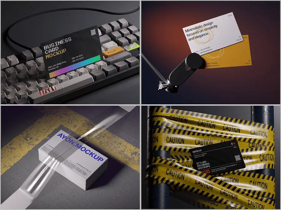
Business Card Mockups on ls.graphics: Where Craft Meets Precision
If you’re serious about presentation quality, ls.graphics deserves a place in your toolkit. Their business card mockup collection is built for designers who care deeply about details — every file features organized, clearly labeled layers so you can drop in your artwork and adjust everything in minutes, not hours.
The ultra-realistic rendering is genuinely impressive: natural light behavior, subtle surface reflections, and paper grain make digital designs look as though they’ve already left the printer. Wide angle variety — dramatic close-ups, flat lays, stacked compositions, floating cards — means you never have to compromise on perspective. Different color styles keep the mood flexible, while the consistently minimalist compositions let your design breathe and speak for itself.
For designers who present work to clients regularly, this kind of quality is professionalism made visible.
Conclusion
Choosing the right business card mockup is an act of creative judgment that ripples outward. It shapes how clients feel about their brand, how your portfolio reads to the world, and whether your design work is understood at its full value.
Start with brand personality. Consider angle and context. Let the background amplify rather than distract. And when you’re ready to present at the highest level, resources like ls.graphics offer the kind of premium, thoughtfully crafted mockups that make the gap between concept and reality feel almost invisible.
Your design deserves to be seen clearly. Give it the right stage.