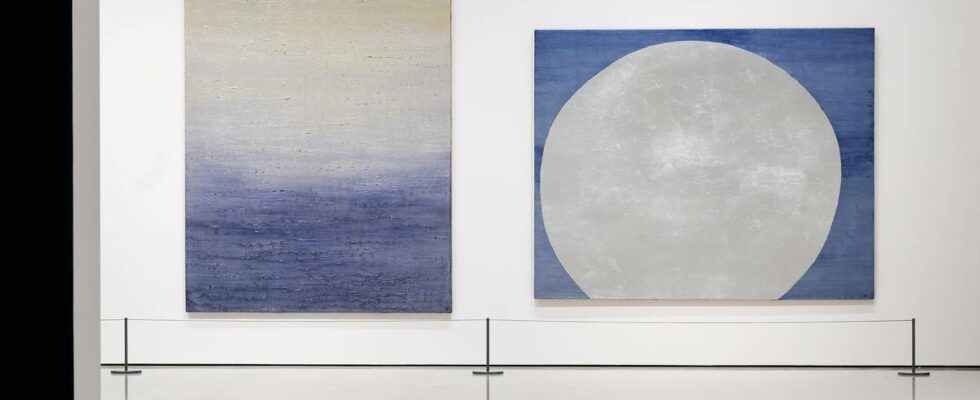
I might as well admit it right away: This is an exhibition I’ve been dreading reviewing. Anna-Eva Bergman is today considered one of our leading abstract painters. She has been brought up to honor and dignity after ending up in the shadows like so many other female artists. About Anna-Eva Bergman Photo: Fondation Hartung Bergman Born: 1909 in Stockholm Background: Swedish father and Norwegian mother; moved to Norway after his parents’ divorce Growing up: Partly in Fredrikstad, Hardanger and Oslo Education: Started at the Norwegian School of Handicrafts and Art Industry at the age of 16, continued at the Norwegian Academy of Fine Arts with Axel Revold as a teacher Personal life: Married first to Hans Hartung, then to Fridtjof Lange, and then with Hartung again Artistic development: Started with figurative language Studied Byzantine and medieval art during the war Traveled to Northern Norway in 1950, an important source of inspiration Began to use metals such as gold, silver and copper in his paintings around 1950 Exhibitions: First exhibitions in Norway in 1950 and 1961, without much attention. 1969 Later life: Moved to Antibes in 1973, died in Grasse in 1987 Aftermath: Major exhibition at the Museum of Contemporary Art in 1996 and at the Musee d’art moderne de la ville de Paris in 2023 It says something about the position she has been given here to country that when the Munch Museum last year presented abstract expressionism through the exhibition “The Forms of Freedom”, she was the only Norwegian representative. But: Ever since I was young, I have had problems understanding the completely unison, almost uncritical tribute to Bergman’s abstract silver and gold works. Didn’t dare say it out loud When I first saw some of these pictures as a student, I thought in my quiet mind that they were simply rather gaudy and banal, such as a shiny silvery wave against a light blue background painted in the early 70’s -the number. FULL CRISIS: In my eyes, this is a full crisis. Wave with silver paint. I think this is right on the border between disgusting and harry. Photo: Fondation Hartung Bergman. Bergman, Anna-Eva/BONO I was of course careful not to say it out loud. I figured that there were things about these canonized works that I would later come to understand, and that it was best not to blame myself. The small, uncomfortable shame of not quite being able to acknowledge such a celebrated artist, who is even a woman, has followed me over the years. It has probably also contributed to the fact that I, as a critic, have, without thinking about it, avoided Bergman a bit. As I walk with quick steps towards the National Museum, I know that this time there is no way out. And I hope for the longest time that it will be a wide-ranging exhibition. But as expected, unfortunately, it is precisely the metallic works that are also in focus this time. LARGE AND STATIC: Bergman worked in this period with large, simple forms and static elements. She apparently sought something eternal and timeless, as in the silver pyramid straight ahead. But in the picture on the left, it looks like through her line play (perhaps a little inspired by her husband Hans Hartung?) she strives for movement and dynamism. The image is quite powerful, it looks like a very meadow with long grass bending under a golden sky. It is a shame that the exhibition does not include some of her graphic works to show how she managed to create dynamism, movement and breath in such a static medium as woodcuts. Photo: Bergman, Anna-Eva/BONO / Nasjonalmuseet/Børre Høstland Competent artist, uneven painter Around 1950, Bergman began experimenting with metal. Not only silver and gold, but also copper, tin, aluminum and brass. The exhibition title “She becomes Anna-Eva Bergman” suggests that it was exactly this that made her who she is – and that precisely this phase from 1950 to 1975, which the exhibition spans, is the most important in her artistry. It is here that she finds her uniqueness and style signature as an artist. MORE INTERESTING: This triptych has not been shown in its entirety since 1956. Here we see how she plays line and flat against each other, abstraction against more figurative elements. Although there is a bit too much of everything: It often appears as if she has a certain reluctance to make clear choices. The whole thing also appears as a bit unsolved compositionally. But this work belongs to a group of works that I find far more interesting than the static works with silver and gold. Photo: The National Museum/Børre Høstland When we look at the full breadth of Anna-Eva Bergman’s artistry, there is no doubt that we are dealing with a very competent artist. And personally, there are completely different parts of her work catalog than the metal images I would focus on. For example, I like both her early Paul Klee and Juan Miro-inspired paintings, her humorous satirical drawings and her wonderful simplistic figurative portraits. SKILLED FIGURATIVE PAINTER: This self-portrait from 1946 shows that she has considerable competence as a figurative painter. Here she simplifies the subject in a very effective way. There is a very nice color play between the golden skin and the bluish-purple sweater, but also between the red mouth and the green shading in the background. The eye area is perhaps perceived as a bit clichéd, and one eye sort of pops out a little, but it is also this small twist that gives the painting expressive power and uniqueness. Photo: Fondation Hartung Bergman I also think she is far more exciting as a graphic artist than as a painter, perhaps precisely because here she doesn’t hang so much on the surface – but can devote herself to exploring different form-related means. In her woodcuts, she occasionally manages to bring movement and breath into the basically static medium. Disbelief and confusion Standing in the exhibition, I unfortunately have to admit that neither age nor experience has helped me any closer to an understanding of what this unison jubilation is about. In front of the same silvery wave, I am as disbelieving and confused as I was then. The truth is that I experience Bergman as a very uneven painter, and this is largely due to the extensive use of silver and gold. This is called “Fire”, has a lot of life and play, but it seems a little indefinite. There will be no overall composition. There is no form-wise conversation between the elements in the image, and the forms have an unclear relationship to the format. I like the tension between the yellow and the golden part, although the yellow is a bit flat and lifeless. This also leaves an indeterminate impression, the composition does not fall into place. I think the picture would have won on a slightly higher horizon line. Here she depicts a surface of water with gold playing in the silver. Butter on pork! Compositionally, the image lacks visual hierarchy. There is nothing that comes to the fore at the expense of something else. Here we see images characterized by a much clearer choice of form. But I think the coloring is quite boring. These are so-called neighboring colours, with subtle transitions between different shades of blue and silver. A bit banal and uninteresting, if you ask me. I note that the use of gold is connected to medieval light mysticism, that fellow critics describe it in panegyric terms as abstract translations of nature’s experiences of light. I myself cannot see it as light at all. It will only be “shine” and surface. Lame compositions So what exactly is the problem with the surface shining? What does the metal do to the image expression? In one of her pictures from Finnmarksvidda, we see it very clearly: Here, the opaque and flat silver shapes break into the other living play of lines. The beautiful contrast between burgundy and sea green is disturbed and punctuated by the sharp silver shapes. The silver breaks up the natural harmony between the colours. But the intersecting diagonals in the pictorial composition add excitement and life to the expression. The image would have gained additional tension if Bergman had tilted the horizon line a little. Here she has taken inspiration from the Finnmarksvidda and combined gold, gray and black. In the lower part there is life and movement, but the visual energies are not carried out; the black part of the sky becomes like a drain in the whole, a dead and lifeless surface. I also often think that her compositions are lacking in terms of form. Many of the images have something unclear, unresolved and almost forced about them. Sometimes they also lack a clear visual hierarchy. It sometimes appears as if she has had a certain reluctance to make clear choices. I think it’s a shame that the National Museum does not see itself in a position to give a wider presentation of this varied artistry. Why is it once again this most famous and, in my eyes, least interesting group of works that is highlighted? news reviews Photo: Nasjonalmuseet/Børre Høstland / Bergman, Anna-Eva/BONO Title: “She becomes Anna-Eva Bergman” Curator: Wenche Volle Location: Lyshallen, Nasjonalmuseet, Oslo Period: 14.6.–24.11.2024 Estimated time: 30– 60 minutes WATCH DOCUMENTARY: Her art was long overlooked. But the light she creates in her paintings has a spirituality rooted in Norwegian landscapes that also resonates in our time. Now she is being celebrated with a large exhibition at the National Museum. Published 06.08.2024, at 10.54
ttn-69
“She becomes Anna-Eva Bergman” at the National Museum – Reviews and recommendations