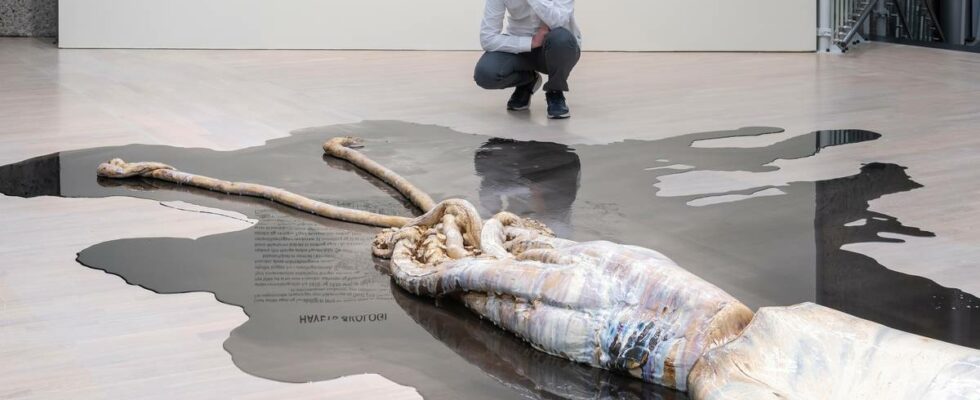
One of my biggest disappointments as a child was when I discovered that the seahorse was just a flimsy little fish creature – and not as I had imagined it: a sea-green stallion with a shimmering blue mane galloping through the bodies of water. This is probably how many of us have fantasized, written poems and dreamed about strange and enigmatic beings who may be found deep down in the blue darkness. The sea is the most mythical part of our nature. It is this mythical and mysterious that has not only stimulated people’s imagination at all times, but has also inspired art. FANTASY: This ceramic octopus by David Zink Yi is quite engaging. Here, myths and reality collide. A real deep-sea animal that almost belongs among the mythical animals, but is nevertheless real. Photo: Øystein Thorvaldsen/Henie Onstad Kunstsenter Wide entrance On the way into the exhibition, I think that this really is a nice and wide thematic entrance. The sea is not for those with special interests. It doesn’t just concern those of us who enjoy sailing, swimming, rowing, diving or fishing; it is the planet’s lungs, and as such an essential prerequisite for all life on the planet. And this is really an exhibition full of contrasts, good and bad. Here there is everything from great art to what should probably be described more as curiosities. The first thing that greets me at the entrance is Frida Hansen’s masterful Art Nouveau tapestry from 1921, which shows mermaids gathering seaweed and sea grass. MASTERFUL: Frida Hansen’s “Mermaids” (1921), on the left in the picture. Photo: Øystein Thorvaldsen / Henie Onstad Kunstsenter The next thing I stop at is Trevor Paglen’s eerie and atmospheric photo series showing internet cables at the bottom of the Atlantic Ocean. In the blue-green, dark depths, we see the cable stretching like a thin line across the sand, a silent reminder of these blood vessels at the bottom of the ocean: the physical fiber optic cables that enable all our digital communication. MOOD CHARGED: Trevor Paglen’s photo series of fiber cables on the bottom of the Atlantic Ocean. Photo: Øystein Thorvaldsen / Henie Onstad Art Center Maritime motifs The exhibition also embraces a number of classic maritime motifs from both the 18th and 20th centuries. Dramatic depictions of shipwrecks and storms featured strongly in romanticism. Here we find both masterly and less masterly examples from great artists such as Turner, Constable, JC Dahl and Balke. A highlight is undoubtedly Peder Balke’s “Lighthouse in the fog” from 1865. The picture shows the extent to which he differs from the traditional Romantic depiction of nature. It almost looks as if the lighthouse is hovering over the landscape, giving the image an almost futuristic and unreal feel. ONE OF OUR GREATEST: The alternation between white, beige, grey, black and moss green is typical for Peder Balke. As a painter, he was a magician who could conjure up an entire landscape with a few powerful strokes of the spatula. He used everything from spatulas and wooden sticks to his fingers when applying colours. It could be pitch black, and shiny white. With a hard brush, he “wiggled” the paint into the motif in his very own way. He could often use a palette knife or some kind of comb to scrape the paint off again, creating structures in the surface. Photo: Øystein Thorvaldsen/Henie Onstad Art Center Another highlight is a semi-abstract work by William Turner that shows a deserted beach in rainy weather. But the exhibition also includes far weaker works by both of these romantic masters. I am also quite amazed to look at the painting “Malstrømmen” by Per Krohg from 1929. It does not resemble much else painted by Krohg, and in my eyes is an astonishingly bad picture. The exhibition would undoubtedly have benefited from omitting this. Not least it would have been to Per Krohg’s advantage, who really was a far greater painter than this picture would suggest. STUNNINGLY BAD: Poor Per Krohg, who is represented by this work of art. The proportions have gone really wrong here, and the whole picture is very difficult to read. The painting as a whole is very inconsistently designed: look at the little men in the oilcloth in the foreground, who are quite figurative, while the whole middle ground is relatively stylized. Parts of it are also ornamental. It is difficult to see what are waves and what are mountain peaks. Photo: © Per Krohg/BONO / Kim G. Skytte The painting consists of figurative elements, but also parts that are almost abstract and almost ornamental in their expression. It is difficult to see what are waves and what are mountain peaks here. Purely in terms of colour, it is also very chaotic. Halibut stomach sacks and seawater from Høvikodden I love Joar Nango’s translucent sculpture created from halibut stomach sacks, and I like the idea behind Toril Johannesen and Marjolijn Dijkman’s installation, which consists of flasks with seawater and seaweed taken from the fjord out on Høvikodden. There is something nice about the small ecosystems that live their lives as part of the installation. But as quite often with Toril Johannesen, the idea is stronger than the visual design itself. The installation lacks form and expressive power. I like looking at the small flasks of seawater, but I don’t think Toril Johannesen and Marjolijn Dijkman’s installation is expressive. Although there is water and plants from the sea, I feel that we are more in the laboratory than in contact with the sea here. This is really a beautiful little sculpture. It shows how Iver Jåks created strong contrasts with simple means. Here he combines a soft curved shape with a rugged angular shape and plays the soft against the hard and the light against the dark. Through her photo series “Oil tankers I – IV” from 2006, Eline Mugaas will create something sculptural and coloristic in a typical offshore oil architecture. I think this is quite powerful and expressive. Outside the art center I stand and look out over the fjord. I wonder why I feel so disappointed. Although the exhibition could clearly have won on a more discerning selection, it also offers many really strong and thought-provoking works. While dark clouds make the fjord change color from gold glittering blue to grey-green, I think that the disappointment is about missed opportunities. The sea is such a wonderful and rich theme. I do not feel that the exhibition gets full credit for the relevance linked to the climate crisis. But even worse is that it fails to come into contact with the great adventure that the sea represents, and which is on speaking terms with the child within us. news reviewer Title: “Atlantic Ocean: Myths, art, science” Curator: Susanne Østby Sæther Museum: Henie Onstad Art Center Location: Høvikodden, Bærum Time frame: 26.4.–15.9.2024 Estimated time: 50–70 minutes Participating artists: Gösta Adrian Nilsson, Betzy Akersloot-Berg, Anna Ancher, Pia Arke, Kader Attia, Knud Baade, Peder Balke, Willem Barentsz, Adolphe Jean Baptiste Bayot, Hans Johan Fredrik Berg, Anna-Eva Bergman, François-Auguste Biard, Anna Boberg, Dineo Seshee Bopape, Franz Ludwig Catel, John Constable, Johan Christian Dahl, Marjolijn Dijkman and Toril Johannessen, Matías Duville, Arne Ekeland, Nicolaus Germanus, Frida Hansen, Thorolf Holmboe, Marie Kolbæk Iversen, Eugène Jansson, Joan Jonas, Iver Jåks, Theodor Kittelsen, Jessie Kleemann , Christian Krohg, Per Krohg, Emile Lassalle, Barthélémy Lauvergne, Armin Linke, Jan Huygen van Linschoten, Olaus Magnus, Auguste Etienne François Mayer, Gerard Mercator, Charles Louis Mozin, Eline Mugaas, Edvard Munch, Joar Nango, Rolf Nesch, Abraham Ortelius , Trevor Paglen, Jean Painlevé, Sondra Perry, Erik Pontoppidan, Axel Revold, Léon Sabatier, Anders Fredrik Schöldebrand, Allan Sekula, Fin Serck-Hanssen, JMW Turner, Susanne M. Winterling and David Zink Yi. Published 30.07.2024, at 10.40
ttn-69
“The Atlantic Ocean – myths, art and science” at Henie Onstad Art Centre, Bærum – Reviews and recommendations