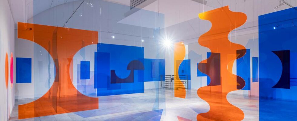
The other day my daughter said that she would like to be a literary critic when she grows up. It got me thinking about how professions are mysteriously passed down. We don’t have a guild any more, and no one says you should stick to your wish, yet that’s often how we end up; by following in our parents’ footsteps in whole or in part. Lawyers’ children are drawn to the law, just as doctors’ children want to study medicine, and artists’ children often end up in the art field. A wonderful example of exactly this is the weaving queen Synnøve Anker Aurdal and her daughter Siri Aurdal. Perhaps art was such a natural path for Siri Aurdal that she limited her maternal rebellion to replacing textiles with Plexiglas and metal? “FOSSEN” (SYNNØVE ANKER AURDAL, 1984-89): Many of the works are more like three-dimensional sculptures or installations; like her light waterfall of braided vinyl rope and metal wire falling against a round mirror on the floor. Photo: Erik Sæter Jørgensen/MUST «CONVERSATIONS» (SIRI AURDAL, 2018): The installation consists of clean-cut plexiglass shapes. The transparent elements overlap and a magnificent three-dimensional painting. Shapes and colors connect in effective ways. Photo: Erik Sæter Jørgensen/MUST “RAIN” (SYNNØVE ANKER AURDAL, 1968): “Rain” (on the left) is an exceptionally beautiful work where beads create movement and the illusion of raindrops.«Interview», Siri Aurdal, 1968/2013 Colored Plexiglas Stavanger art museum/MUST Photo: Erik Sæter Jørgensen/MUST “ISLANDS KLOKKE” (SYNNØVE ANKER AURDAL, 1976): Here we also see a kind of rope sculpture that can lead the mind to Magdalena Abakanovic. Photo: Courtesy of the artist’s home and gallery Riis Two prominent artists When I read about the exhibition online, I thought that I have been waiting for this for many years; to get the opportunity to see the two works of art in context. Because despite the obvious differences, there is certainly a common property and a kinship that can be difficult to spot when you see them separately. We are really talking about two striking artists: two women who each tower in recent Norwegian art history, and who have developed their own distinctive and individualized idioms through very different media. These are two artists who have both paved the way and broken boundaries within their own field. And both mother and daughter have had the opportunity to represent Norway at the Venice Biennale. There is no doubt that the two universes complement each other. Here, things really happen in the showroom. Fantastic harmony One of the first things that meets us is Siri Aurdal’s sculpture “Bølgelengder”. «BØLGELENGDER» (Stavanger), 2024: The expression is hard and mechanical, but at the same time organic and seemingly weightless. Fiberglass-reinforced polyester pipe and metal fittings. Photo: Erik Sæter Jørgensen/MUST Photo: Erik Sæter Jørgensen/MUST Photo: Erik Sæter Jørgensen/MUST Photo: Erik Sæter Jørgensen/MUST I could have stayed a little forever and enjoyed the simple and raw, industrial beauty of this work. Based on giant grey, fiberglass-reinforced polyester tubes, she has created beautiful, dynamic wave forms. Along with this powerful work hangs a shiny yellow tapestry created by Synnøve Anker Aurdal: In the simplified tissue expression that portrays something resembling a dragon or a snake in a stylized saga style, we find again the dynamic wave form that characterizes the younger Aurdal’s room installation. “DYNAMIKK 1” (1996): Rectangular picture tapestry by Synnøva Anker Aurdal with black and blue-purple on a yellow background. Profile figure with stylized head and protruding hair. The body has vertical lines towards the feet, which point down. The hand is in black and blue-purple. It fascinates me how these individually quite intricate works of art can unfold simultaneously and in unison without disturbing each other. On the contrary, I think they mutually emphasize each other’s unique qualities. A living conversation I stand for a long time and look at Synnøve Anker Aurdal’s iconic “Chinese Wisdom” from 1967. “CHINESE WISDOM” (1967): Synnøve Anker Aurdal’s deep interest in poetry is also reflected in several of her works. From the 1960s, she wove text quotations into the fabric. It was not always so successful. But this work shows what a master she is. Here we see, among other things, the word “happiness” in shiny yellow against a shimmering pink and orange background. It’s a wonder it doesn’t come across as clichéd and kitschy. But it is quite simply because she so masterfully manages to integrate the letters into the composition, make us see them as shapes in the whole, more than as meaning-bearing sizes. Photo: Erik Sæter Jørgensen/MUST Here she plays out a rich scale of red tones from old pink and burgundy to shrill orange and lemon yellow. She not only aligns narrow rectangles and pointed ellipses against each other, she also interweaves letters, which in itself is very demanding. With great skill, she makes the words form part of the whole more as part of the form composition, than as something meaningful. In other words, it is a rather complex expression in itself, which I would initially think would need a lot of air around it. It is therefore astonishing how beautifully and expressively it can be incorporated into Siri Aurdal’s colorful and richly shaped Plexiglas installation “Interview” from 1969/2013. “INTERVJU” (1969/2013): Siri Aurdal is concerned with the primary color contrasts: Here she plays the rail red, and pale pink against deep grass green. Here, too, interesting deeper denominations arise when the colors are mixed. The sculptures also create beautiful colored shadows. The work was first shown in 1969 and reproduced for an exhibition at Kunsthall Oslo in 2013. Photo: Erik Sæter Jørgensen/MUST Here, Aurdal plays complementary contrasts against each other: A pale pink semi-arch shape becomes a vault over the whole, which ties the installation together. With circles, surfaces, waveforms and rectangles in deep burgundy against dark grass green. Here, a beautiful play of color occurs both in the shadows that the Plexiglas forms cast on the wall and on the floor, but also where the semi-transparent elements overlap and form mixed values. Natural references as common property The title “Waves and moons” points to a fundamental fascination with nature that can be found in both of these works of art. With Synnøve Anker Aurdal, the shape of the moon is often a motif that opens up lyrical associations with nature, while the wave constantly appears as a natural refrain with Siri Aurdal. The exhibition thus creates a lively conversation between the two artists, at the same time that individual works of both come very well into their own right. “Waves and moons” offers powerful formative power for two generations. This is excellent curatorial work! Mona Pahle Bjerke tells in Nyhetsmorgen 23 July 2024 about the exhibition “Bølger og måne” by Siri Aurdal and Synnøve Anker Aurdal. news reviews Title: “Waves and moons” Artist: Siri Aurdal and Synnøve Anker Aurdal Curator: Hanne Beate Ueland, in collaboration with Siri Aurdal and Eline Mugaas Place: Stavanger Art Museum (MUST) Time: 15 June – 1 September 2024 Estimated time in the exhibition: 45 – 60 minutes Published 23.07.2024, at 06.25 Updated 23.07.2024, at 09.57
ttn-69
“Waves and moons” by Siri Aurdal and Synnøve Anker Aurdal at Stavanger Art Museum – Reviews and recommendations