
Heat waves are lasting longer and appearing more frequently, while floods and torrential rains have become increasingly common. The changing weather patterns are largely a result of climate change. A compelling way to visualize this altering landscape is through interactive climate maps, including one that showcases data from as far back as 1940 and another projecting conditions in 2080. Interestingly, places like Seville share climate characteristics with regions in Zambia or northern India, emphasizing how interconnected our world has become in terms of climate.
Discovering Climate “Sisters”
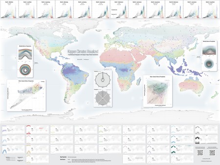
How can we make these intriguing connections? The answer lies in the Climate Visualized interactive map. This tool, designed by Atlas Guo from the University of Wisconsin-Madison, allows users to explore weather patterns globally using the Köppen-Geiger classification system, revealing climate “brothers” around the globe.
The Köppen-Geiger Classification System
Established in 1884, the Köppen-Geiger classification is the most widely used system in geography, ecology, and climatology. This powerful classification divides the world into five main climate zones—tropical, arid, temperate, continental, and polar—along with numerous variants. With the advancements made by Beck et al. in 2018, we now have access to the most detailed global climate map available, further refined by satellite and other climatic data sources.
How the Tool Works
Guo’s tool uses D3.js to transform this data into an accessible, interactive format. Users can hover over a specific location or enter it into a search box to discover its climate type and view detailed monthly climate graphs. These graphs display crucial information such as temperature and precipitation, organized in a circular format, reminiscent of a clock, with each point representing a month.
Visualizing Climate Connections
Each climate data point is color-coded, allowing users to easily find similar climates worldwide. For example, Pamplona’s climate corresponds not only with various regions in France, Belgium, and the Netherlands but intriguingly extends as far as Melbourne, Australia. This illustrates the remarkable diversity and range of climate similarities across the globe.
Implications for the Future
The scientific study accompanying this project also predicts how these climate zones may evolve by the century’s end if current emission trends persist. However, it’s worth noting that the visualization tool only employs the lowest resolution from the study, which simplifies the complex climate landscape. It lacks recent data, remaining fixed at 2020, meaning it does not account for the latest changes brought on by climate drift.
Understanding Global Warming
As heat waves, floods, and erratic weather patterns become the new normal, understanding our climate’s future is vital. Tools like Climate Visualized make critical information accessible to the public, stimulating awareness and encouraging action on climate change. Whether you’re a concerned citizen or a student exploring ecological concepts, this platform offers a gateway to better understand our planet’s ever-evolving climate.
Explore more about the global climate and its implications through this engaging resource at Cartoguophy.