
## Olympique de Marseille Unveils New Logo
Yesterday marked a significant milestone for Olympique de Marseille as they revealed their new logo, aiming to redefine the club’s identity. The new design is rooted in the club’s heritage and dedicated to its vibrant supporter community, dubbed “Le Peuple Bleu et Blanc.” In an official press release, the club emphasized the new identity’s goal: “A new identity inspired by and designed for Le Peuple Bleu et Blanc, creating a language that will connect supporters around the world.”
### Alban Juster’s Defense of the Logo
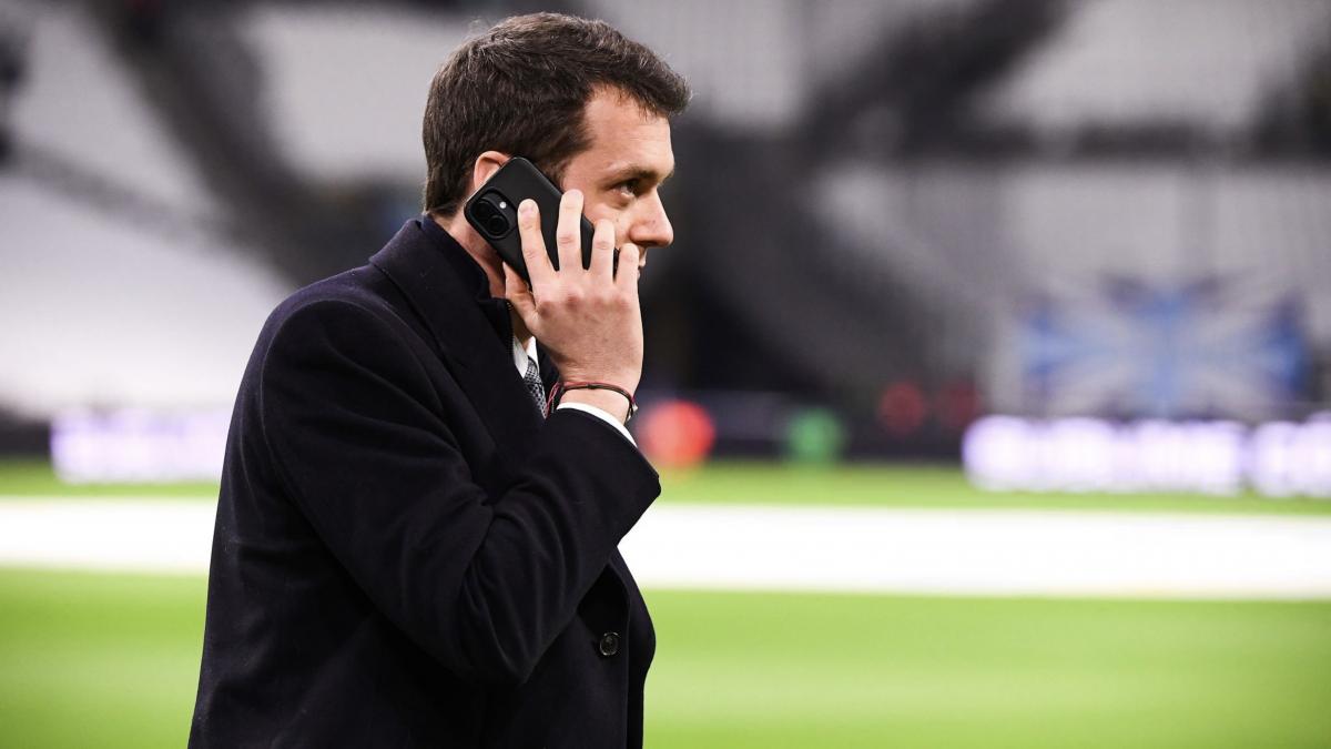
Interim president Alban Juster took the opportunity to address the press, highlighting that this new logo is the result of two years of meticulous planning and effort. He elaborated, stating, “This logo is the culmination of 24 months of work.” Juster underscored the urgency for the club to remain innovative in a time when TV rights are dwindling, noting, “We are at a time when we have fewer and fewer TV rights. Today, one of our most important assets is our brand.”
### Evolution Over Tradition
Juster articulated that the decision to update the logo aligns with a larger evolution within the club, which encompasses improvements to the head office, infrastructure, and stadium. “The club continues to evolve,” he remarked, reinforcing the idea that the logo plays a vital role in the club’s modern facelift.
### The Controversial Absence of the Star
One notable aspect of the new logo is the absence of the iconic star and the “Right to Goal” motto. Juster clarified this choice by explaining that “Removing them from the logo allows for a little more readability.” This decision has sparked considerable debate among fans and critics alike. The star, which traditionally signifies championship victories, remains integral to match kits, jerseys, and training range apparel. Juster reiterated that while it may not appear in the logo, it will continue to be celebrated in other forms.
### Navigating Fan Reactions
The unveiling of the new logo has already led to mixed reactions from passionate supporters. Some feel nostalgic about the traditional design and fear that altering the visual identity may minimize the club’s history. However, Juster believes that this fresh approach can amplify Marseille’s presence, both locally and internationally. The intent is to create a modern, recognizable brand that resonates not just in Marseille but globally.
### Conclusion
Olympique de Marseille’s new logo represents a bold and strategic step towards modernization while aiming to maintain a connection with its deep-rooted heritage. As the club navigates the changing landscape of football and branding, the true test will be how well this new identity is embraced by its storied fanbase. With Alban Juster at the helm, the transition may lead to exciting developments for the club as it continues to evolve in the football world.