
iOS 26 has not only marked a significant change in its branding but has also introduced the most extensive redesign of the iPhone interface in years. The new Liquid Glass interface is characterized by a plethora of transparencies , which may not appeal to everyone. While Liquid Glass cannot be completely disabled, there are methods to adjust your iPhone’s design to resemble previous versions more closely.
Goodbye to Transparencies in iOS 26
As the saying goes, “there’s no accounting for taste.” Some users might be thrilled with the Liquid Glass design , but one undeniable drawback is that the readability of various elements is compromised due to excessive transparency. This issue extends beyond the location of transparent icons; it includes menus and controls that overlap, making them difficult to view clearly. If you share this sentiment, consider the following options.
<img alt="iOS 26 is already here: these are the seven most important novelties that you can try already on your iPhone" width="375" height="142" src="https://i.blogs.es/ff62e1/1366_2000/375_142.jpeg"/> 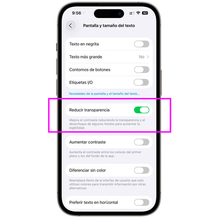
<span>The magic button to get rid of transparencies.</span>The solution is the Reduce Transparency feature, which does exactly what it promises. To activate it, navigate to Settings → Accessibility → Display & Text Size and switch it off. The outcome is a reduction in the translucent effect, allowing elements to stand out much more distinctly. Here are a couple of examples:
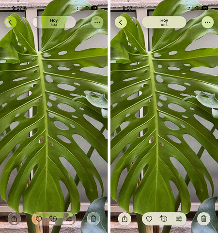
<span>The APP photos controls look vulnerable when viewing a full-screen image.</span>The Photos app serves as a clear example where transparency can hinder usability. When displaying a full-screen image, the buttons become less identifiable if transparency is activated. Moreover, the effect shifts as you move the photo, creating a disorienting experience.
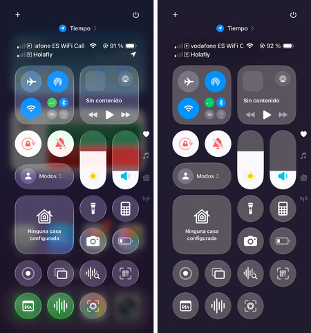
<span>The control center displays improved readability.</span>The Control Center also benefits greatly from this option, but the most noticeable improvement is in the notification panel (shown in the cover photo). The many small texts often require users to scroll, making readability even more difficult. To enhance visibility, enabling the Increase Contrast option, located just below, minimizes the glow effect , providing a flatter appearance.
If you still find the Liquid Glass design unappealing, consider avoiding translucent icons , opting to leave it in the default mode .
Two Extras: Phone and Safari
The redesign extends to system applications, and yet again, it’s not for everyone . Thankfully, users can opt to revert to the previous designs. This applies to applications like the Safari browser.
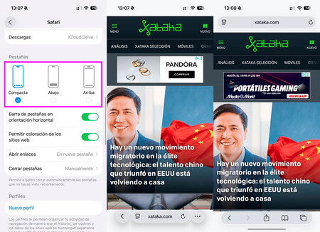
<span>Safari has a new design, but we can return to the old if we want.</span>By default, iOS 26 activates a new compact design for the Safari browser, where the search bar and two adjacent buttons merge into one. Head over to Settings → Safari to choose whether to keep the compact design or revert to the classic interface , which features a top bar and buttons below.
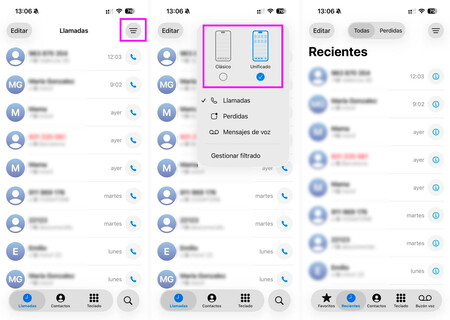
<span>The telephone app also has a new design.</span>Similarly, when launching the Phone app , users are prompted to try the new design. Like the Safari browser, the interface is now more compact, with fewer tabs at the bottom and eliminating the “missed calls” notification at the top. If you’re not convinced by the new layout, simply click the button at the top right to return to the classic design .
Images credit: Amparo Babyloni, Xataka.
For further insights, explore the Xataka piece on iPhone Air: so absurdly thin that Apple had to completely redesign its user experience.